13th Conference on Atmospheric
and Oceanic Fluid Dynamics
- Breckenridge, Colorado, June 2001
Selected items from the poster (May 2001).
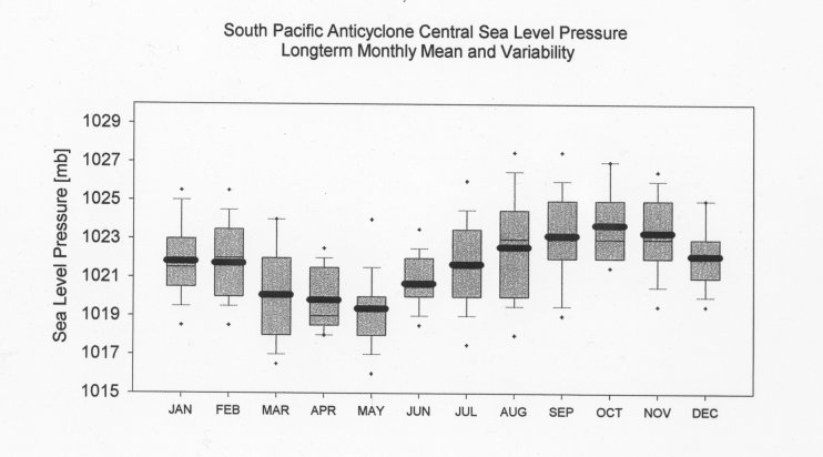
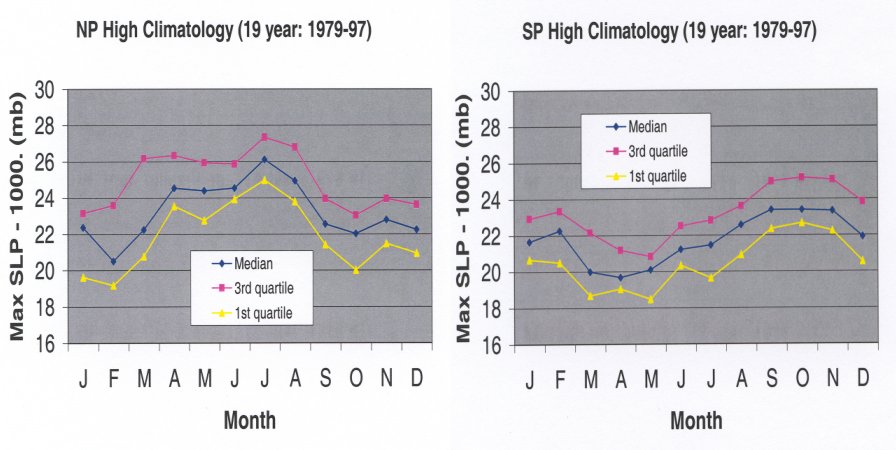
- Fig. showing median
peak monthly mean SLP
for the NP and SP highs by calendar month.
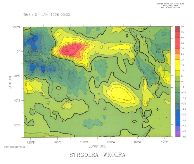
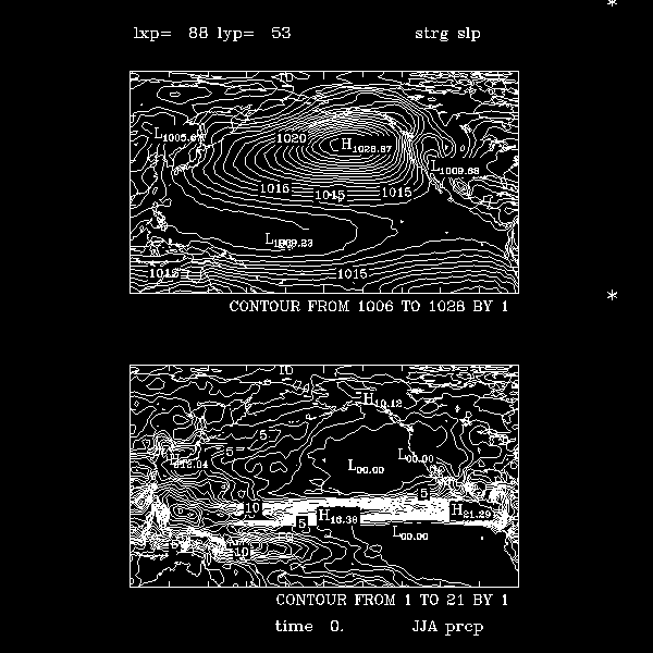
- Fig. showing SLP and P
composites of strong NP highs
during May-September. Significant areas shaded. Anomaly data used.
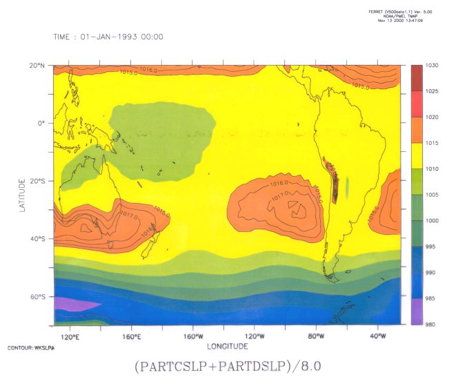
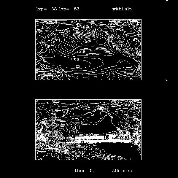
- Fig. showing SLP and P
composites of strong SP highs
during October-February. Significant areas shaded. Note: the
SP high has similar appearance and strength during these months but
it looks very different in March. Anomaly data used.
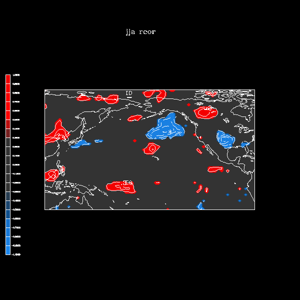
- Fig. showing
NP high 1-pt correlations
of the 2-D P field for selected SLP points to the sides. Total data
are used. THE FIGURE IS THE SAME AS IN THE PREPRINT VOLUME.
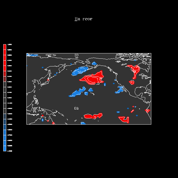
- Fig. showing
SP high 1-pt correlations
of the 2-D P field for selected SLP points to the sides. Anomaly data
are used.
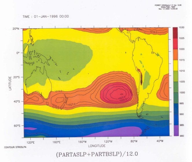
- Fig. showing SLP
composites of strong highs
but with a larger domain. Upper is for summer NH highs lower chart is for
summer SP highs. NP highs associated with some SH changes that appear to
be significant, but SP highs are not associated with NH changes. Anomaly
data used.
- Part of the
poster presentation (text only)
in powerpoint (.ppt) format. Portions of the figures used
are in separate links above.
Preprint volume (material dated from January 2001)
-
Extended abstract using color figures
(1.2 Mb size)
-
Extended abstract using black and white figures
(0.5 Mb size)
-
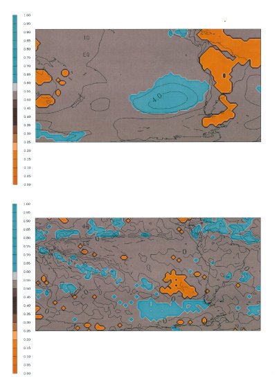
Enlarged version of Figure 1. as in the preprint volume making a
comparison of OLR and P composite differences using
strong SP highs minus weak SP highs.
-
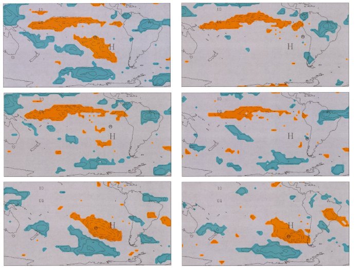
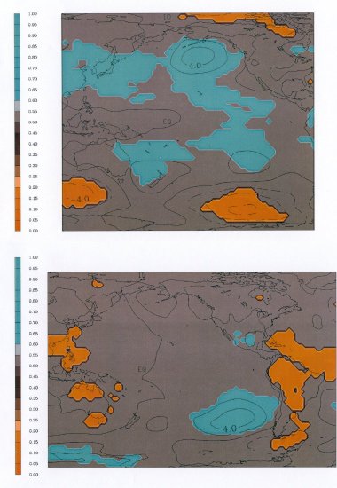
Enlarged version of Figure 2. as used in the preprint volume showing
1-point correlations using 6 different points
(marked with a circle)
surrounding the climatological NP high location (marked by an H).
Shaded areas have correlation exceeding a 95%
significance test. Contour interval is 0.1 correlations that
exceed 0.3 in magnitude.
Note: the color scale on the 1-pt correlation figure differs
from the color scale used below. Here a "negative" (color reversed)
image was prepared from the black-background figures below.
Consequently, lighter shading
(cyan) here is red below and dark brown here is blue below.
6th Southern Hemisphere Meteorology Conference
Presentation - Santiago, Chile April, 2000
(selected figures only)
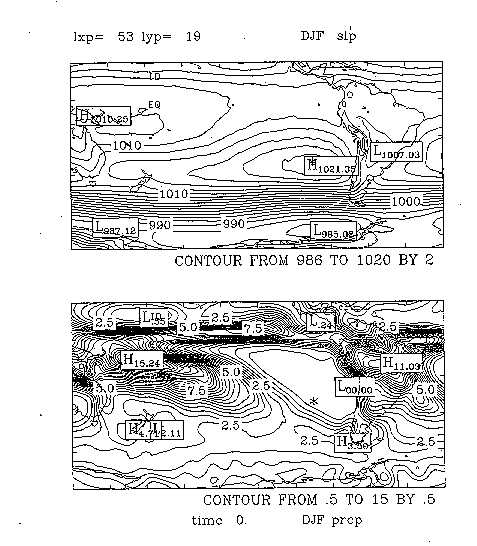
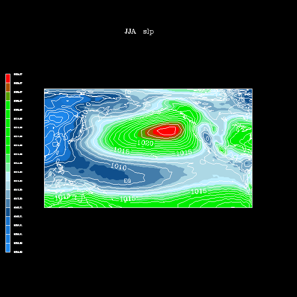
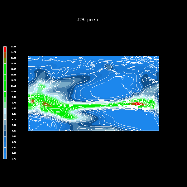
- Average:
SLP and precip.
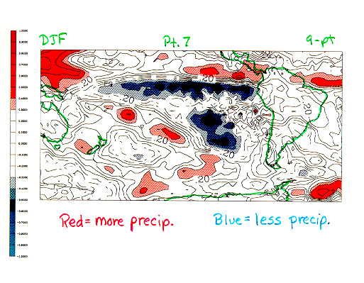
- Composite figures.
Red means greater value for the strong highs composite. Blue means
less value for the strong highs (i.e. greater value for the weak highs).
- SLP difference strong minus weak
highs
- Precip. difference strong
minus weak highs
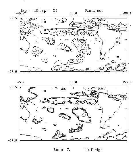
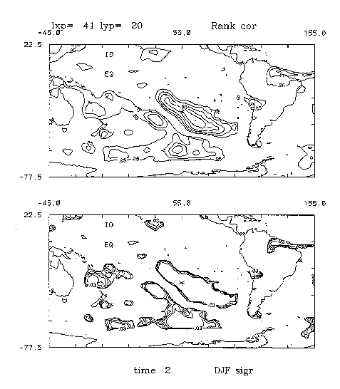
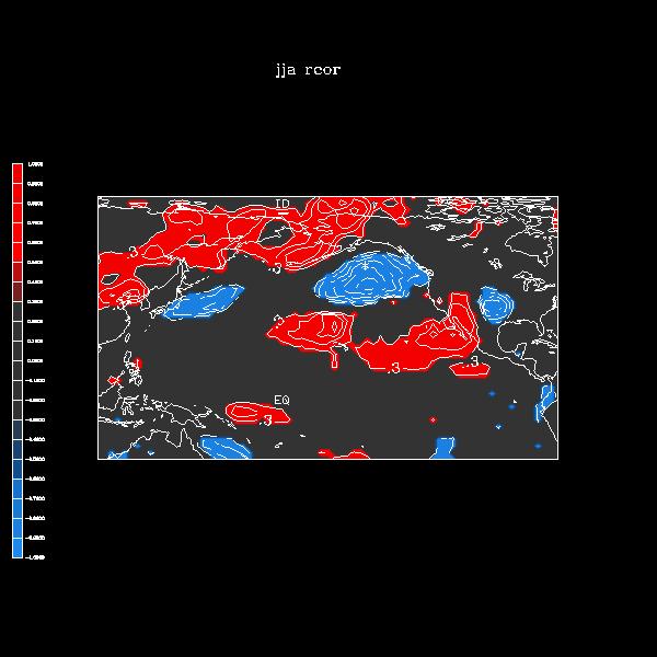
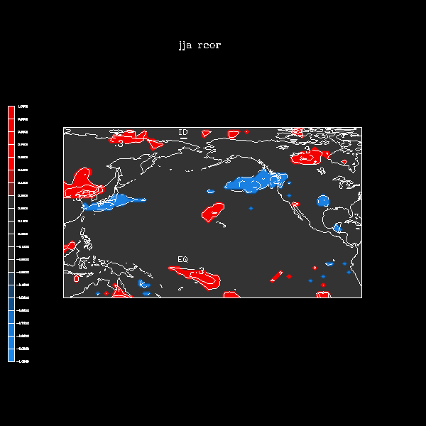
- 1-point rank correlations:
Color is used to see the sign of the correlation: red is
positive, blue is negative. Values above magnitude 0.3 are
shaded.
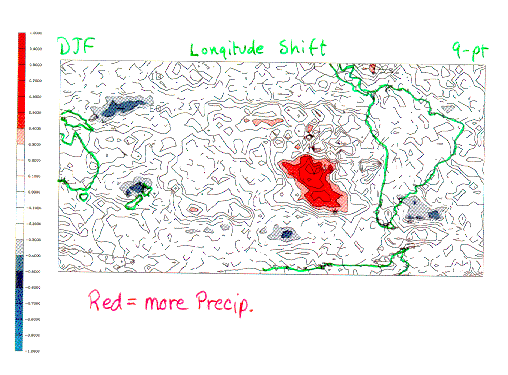
Red means higher precipitation for positive value of the
"1-point" quantity. For example, the red area in the longitudinal
shift means that when precip is higher there, the location of the
peak SLP value is further east. In other examples below, red
means higher & blue means lower precipitation is associated
with a higher SLP value.
Several examples have roughly parallel bands of opposite
sign. Such a "dipole" pattern implies a shift, in general, of
a band of precipitation such as the ICZ or SPCZ.
Note that shading for correaltion magnitudes >0.3
corresponds closely to the 5% level.
To illustrate
the correspondence between 0.3 correlation and significance,
several cases are reproduced below with
a companion plot of
one of the two significance tests.
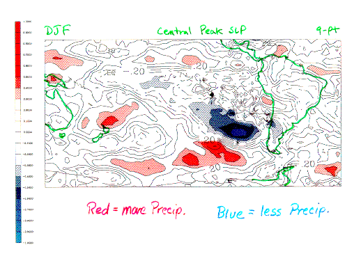
-
SLP at the central peak of the high
-
Longitudinal location the central peak of the high
-
SLP at a point northwest of the central peak
-
SLP at a point north of the central peak of the high
-
SLP at a point southwest of the central peak of the high
- 1-point rank correlations (upper plot) starting
with 0.25 magnitude of correlation.
The lower
plot shows significance
test contours (at 5%, 4, 3, 2, and 1% levels)
In many regions (these and other figures not posted) the
1% contour is quite similar to the 5% contour.
-
SLP at a point northwest of the central peak
-
SLP at a point southwest of the central peak of the high
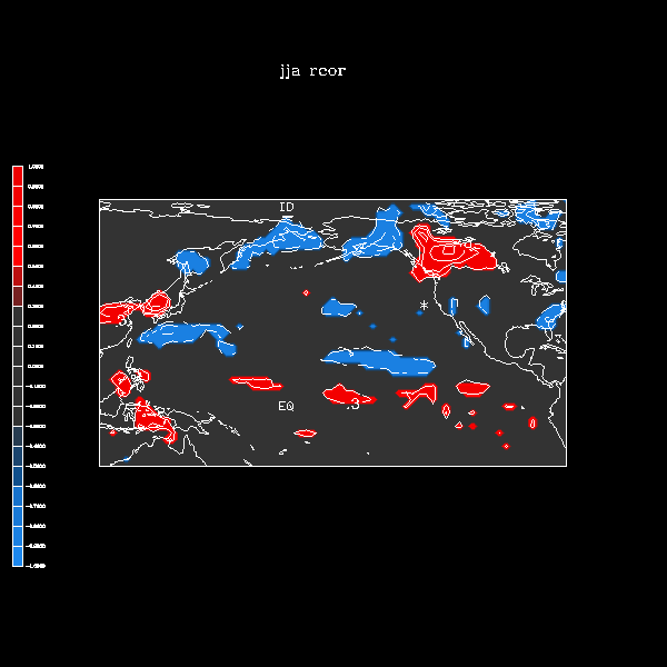
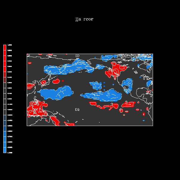
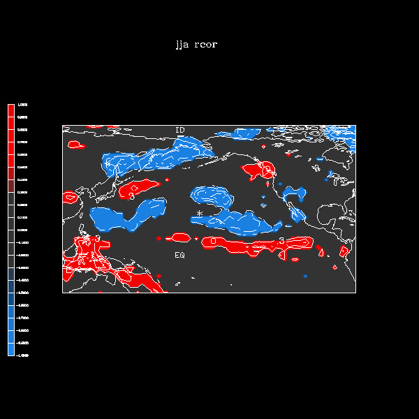
Northern Hemisphere Subtropical High experiments
- Average fields for the 45 months of June, July, and August
- "1-point" Correlations:
1-point correlations that compare a SLP property against
a two-dimensional precipitation field.
These correlations use the following plotting convention:
contours are at 0.1 interval for correlations whose magnitude
meets or exceeds 0.3. Also, shaded areas denote regions where
the correlation passes a 95% significance test. Blue indicates a
negative correlation; red a positive.
For 8 grid points that surround the center of the summer
subtropical high. A 9-point average is used to define the
"grid point" value.
The images move clockwise around the anticyclone
center starting in the NW quadrant.
- NW of high
- N of high
- NE of high
- E of high
- SE of high
- S of high
- SW of high
- W of high
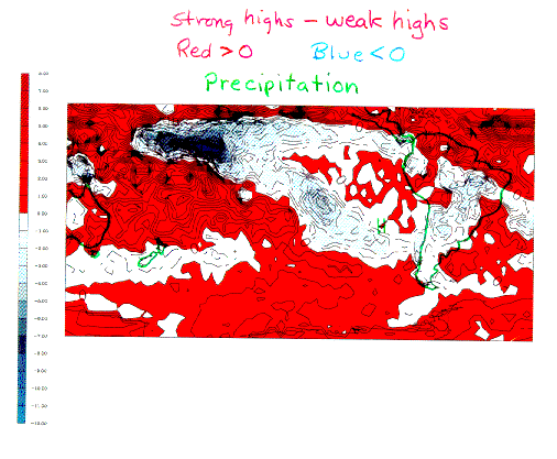
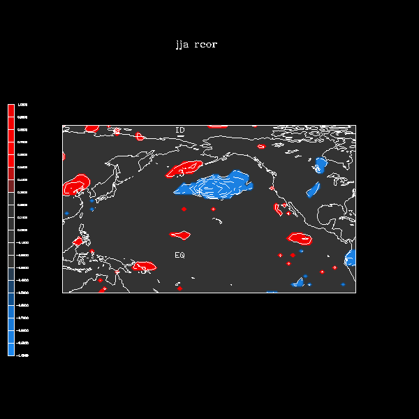
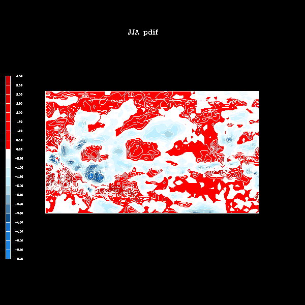
- Composites:
Stong minus weak composites of...
- SLP
- Precipitation
Red means more precipitation for the stronger highs;
blue means less precipitation for the stronger highs.
- Mixed results: (examples)
- slight evidence supporting the "current view" (unlike the
correlations) is perhaps the most notable. Stronger high with
more precip over Mexico and northern Central America,
though there is less over the Caribbean and the ICZ is shifted
away (dipole pattern) so there is less precip over much of the area to
the southeast of the high, as well.
- Dipole pattern appears elsewhere, too. in
tropical west Pacific implies shift of precipitation away from the
high when high is stronger -- similar to the result found in the
South Pacific subtropical high.
- The postulated storm track
shift (seen strongly in 1-pt correlations) is not so obvious here.
- Need to reexamine the months chosen for these composites. Perhaps
more definitive examples can be selected from a longer record. Greater
sample size, isolating competing effects, etc.
Miscellaneous
- .gif movie"
monthly mean SLP
The blue contour is the 1016mb and the red/pink contours are 1020mb
and higher with a 1mb increment. Green indicates annual average.
Notice the sloshing back and forth of mass between the Northern
and Southern Hemispheres.
file produced by Ms. Sheri Immel